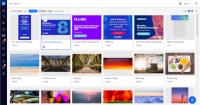
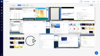
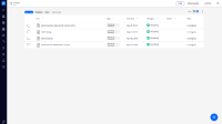
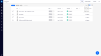
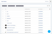
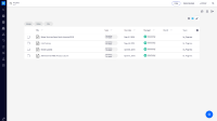
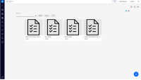
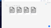
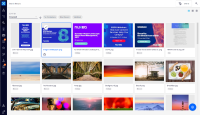
Today, folderish view allow a low height area to provide the children content on both grid and datatable.
Review away to improve this.
One solution might be:
In the UI we are dealing with quick filters and actions (switch view mode from table to grid, spreadsheet edition).
We should think about a solution to group all these actions related to the listing in a toolbar. Goal is first to see if we can find a solution to achieve that.
See screenshot as an example.
Depending of the solution this NXP ticket might be move to the ELEMENTS project.
Solutions on the mockups attached
The Sort and the quickfilters are included (implementation) in the results-list element.
For further changes, and possibly include everything in only 1 line, they would need to be extracted, and start being part of the general Results view.
As a first step improvement, it as made an additional ticket with a UI restyle of the sort element.
Further study available at:
https://projects.invisionapp.com/freehand/document/rkDCbpve1
- is related to
-
DESIGN-150 Improve the nuxeo-sort-select element
-
- Resolved
-
-
ELEMENTS-183 WEB UI > Style quick filters
-
- Resolved
-
- is required by
-
NXP-25637 Improve listing top area spacing
-
- Resolved
-
