-
Type:
Improvement
-
Status: Open
-
Priority:
Minor
-
Resolution: Unresolved
-
Component/s: NOS
-
Tags:
-
Team:NOS
-
Story Points:2
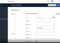
Space waste between categories and fields becomes an issue when it comes to smaller screens.
- Related buttons to categories are confusing
- Categories and fields makes no sense anymore due to its arrangement
- Field's column are way to far from its related category


