-
Type:
Task
-
Status: Resolved
-
Priority:
Minor
-
Resolution: Done
-
Component/s: Ergonomy & UX
-
Epic Link:
-
Sprint:nxGang Sprint 11.1.15
-
Story Points:0
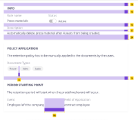
When the user opens a retention policy to see its content:
- Put as title "retention policy" at the top of the page so there's no need to repeat the word "retention" in every category of the policy
- Reorganize category cards according to the amount of information
- Put a label on document type and event expression for the filter
- For the date: move it to horizontal
- On actions: inform the user that actions will occur by the order that is displayed
- mobile responsiveness
Prototype:
- Desktop: https://nuxeo.invisionapp.com/share/AHTL16CC4YT#/379907115_Rule_View
- Mobile: https://nuxeo.invisionapp.com/share/38TL17F7XGD#/380088660_Rule_view
Inspect:
- is related to
-
DESIGN-343 Retention Materials and Review
-
- Open
-

