Uploaded image for project: 'DESIGN'
  1. DESIGN
  2. DESIGN-329

Minimize user confusion on parallel workflow review

    XMLWordPrintable

    Details

    • Type: Improvement
    • Status: Open
    • Priority: Minor
    • Resolution: Unresolved
    • Component/s: Web UI

      Description

      Karin Touchie reported:

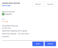
      [in the screenshot attached]
      is the result of testing a parallel workflow with one user approving and another rejecting.

      Problem
      The text alignment and formatting makes it a bit difficult to read and the meaning KO/OK in this context as well as "Consultation Wrap-Up" is confusing.

      Possible Solution
      I think the vocabulary and visuals used could be simplified: :heavy_check_mark: for approved, :heavy_multiplication_x: for rejected, linked avatars for users and "Reviews:" as a heading for the various reviews given.

        Attachments

          Issue Links

            Activity

              People

              • Assignee:
                Unassigned
                Reporter:
                imachado Isabel Machado
                Participants:
              • Votes:
                0 Vote for this issue
                Watchers:
                1 Start watching this issue

                Dates

                • Created:
                  Updated: