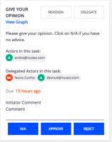
Problem
Since the approve/reject/N/A buttons are configured on Studio, and we do not now their semantic or variable positive/primary negative/secondary we cannot attribute different styling between them.
There are two levels of information and they should be distinct, to avoid creating confusion to the user.
At least consider to distinct default positive vs negative.
- is related to
-
DESIGN-329 Minimize user confusion on parallel workflow review
-
- Open
-
-
DESIGN-114 Mockup delegate & reassign a task
-
- Resolved
-

