-
Type:
Improvement
-
Status: Resolved
-
Priority:
Major
-
Resolution: Done
-
Component/s: Web UI
-
Epic Link:
-
Sprint:nxAI Sprint 11.1.9, nxAI Sprint 11.1.10
-
Story Points:2
Problem definition
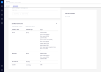
Current page should be more intuitive and clear for the user:
- quick selection of the data set
- Clear distinction of the associated fields
- Why The [Get Statistics] button is not associated to the Statistics Card?
- Why the Statistics Card has such a big height, when is empty?
It might be useful to see the Data Export without scrolling, if no info is showed above.. - Consider a more complete feedback on the Dataset Exported?
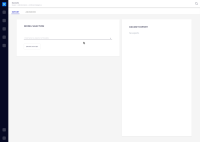
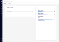
Screenshot of the current solution attached.
See more in Prodpad: https://app.prodpad.com/ideas/907/canvas
Possible Solutions
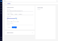
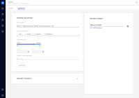
Dataset Export complete userflow and iterarion
https://nuxeo.invisionapp.com/freehand/document/K6UgxXm7J
Conclusions
It should be separated into a basic page and an advanced with more technical and further options.
Progress bar ideally should be graphic and track the done/errors/missing documents.
Two columns layout makes a better space management and info distribution, on smaller screens, basic Y hierarchy should be taken under consideration.
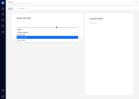
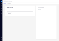
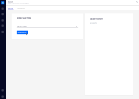
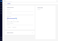
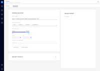
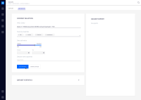
Full userflow screenshots attached and available through invision link.
Navigate between screens: https://nuxeo.invisionapp.com/d/main#/console/17687977/366713616/preview
UI details/CSS inspect: https://nuxeo.invisionapp.com/d/main#/console/17687977/366713616/inspect

