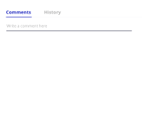
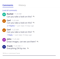
Main changes on the mockups:
- 3 dots vertical
- include dropdown with actions on mockup
- review font-sizes (level 1 & 2)
- Save/cancel on editing
- Nuxeo-dialog message with confirmation for delete
- scenario with zero comments
- load more comments on main thread
- reply (icon or text)
Things to consider:
- The 3 dots with extended actions, show only when the user has permissions to perform an action.
Edit/Remove are the base actions that we provide, and by default, only the creator of the message can edit or remove it.
- Primary level of comments have: avatars with 24px + main texts with 13px + secondary texts 11px
- Secondary level of threads/replies have: avatars with 20px + main texts with 13px + secondary texts 11px
- If the user wants to delete a comment, there should be presented a nuxeo-dialog w/ confirmation dialog, with the following message:
"Are you sure you want to delete this comment?"
Buttons: Cancel/Delete
- Created a Zeplin project, with a link for styling inspect: https://zpl.io/VQEPXKn
New mockups attached.
- is related to
-
DESIGN-394 Review submit/cancel actions on comments
-
- Open
-
-
 NXP-24902
Comments Design
-
- Resolved
-
-
DESIGN-63 Initial user flow and mockups for Comments
-
- Resolved
-


