-
Type:
Improvement
-
Status: Resolved
-
Priority:
Critical
-
Resolution: Won't Fix
-
Component/s: Web UI
-
Tags:
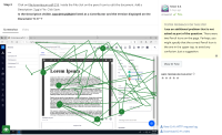
Currently, we have the 'general Edit icon' for the document and also for the blobs + the icon used for the Edit CSV on tables is also a pencil.
This can lead the user for a moment of confusion and hesitation.
We should have different icons for different actions.
- is related to
-
NXP-25707 Substitute edit icon for main blob and attachments
-
- Resolved
-
