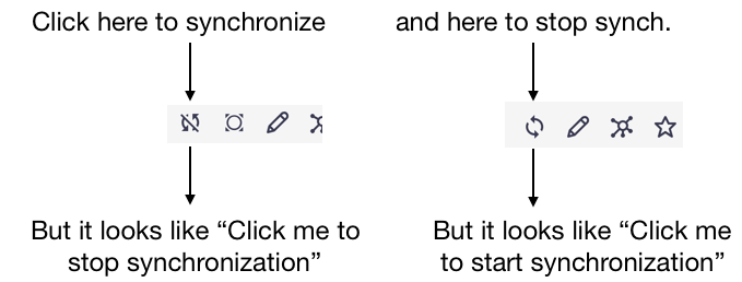
Drive’s buttons look weird to me. Because they actually display the status of the Drive Synchronization. So, for example, when a container is not synchronized, it displays the “not sync.” icon. But then you feel like clicking it will stop synchronization while it’s doing the reverse
by Thibaud Arguillere on #ux-feeedback
(see attachment)
Possible Solution
Currently we have some active state on some icons/actions.
Like favourites. It stays with an active color when it's active.
The synchronise should be consistent, and be more clear to the user.
- Additionally , the icon itself should be reviewed eventually. If the synchronize it's exclusive to Drive, should it be a Drive sync icon?