-
Type:
Improvement
-
Status: Resolved
-
Priority:
Major
-
Resolution: Done
-
Component/s: None
-
Tags:
-
Sprint:nxDesign 10.2.5, nxDesign 10.2.6
-
Story Points:1
Optimize the space and the general UI for a better framing with the content.
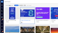
Currently we have 2 lines of text/content which are not necessary. a
And the line/drop area is always the same width. The width can change corresponding the content.
See eBay & Google examples here: https://projects.invisionapp.com/freehand/document/rkDCbpve1
Improvement suggestion
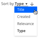
The label of the element should be placed before the name/field itself, to be everything in 1 line only.
The space/lenght of the line should be relative to the content, growing as need, assuring only a minimal padding next to the word.
The dropdown should also change its width accordingly to its content, aligned to the left of the input area.
- is related to
-
ELEMENTS-739 Improvement of the Nuxeo-sort element
-
- Resolved
-
-
DESIGN-4 Improve grid view area on Folderish view.
-
- Resolved
-


