-
Type:
Improvement
-
Status: Resolved
-
Priority:
Minor
-
Resolution: Done
-
Component/s: Web UI
-
Sprint:nxDesign 10.2.5
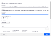
The required symbol ![]() appears with absolut positioning, aligned right in the end of the text field.
appears with absolut positioning, aligned right in the end of the text field.
This is an important information, and the user should not be looking for it in the form.
In long forms and with possible big widths, sometimes this may be valid information that the user has no immediate perception.
Solution
Reposition of the * right next to the label.
- is related to
-
ELEMENTS-707 Change positioning of the required symbol on widgets
-
- Resolved
-
-
DESIGN-189 User Research for required fields symbol
-
- Resolved
-
- is required by
-
NXP-25130 [Firefox] Reposition "required" asterisk in Parallel document review
-
- Resolved
-
